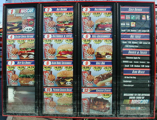
The information Ted presented really got me thinking about how we look at data structure and menu building. It was especially applicable to me. We are getting ready to redo our corporate Intranet and very much need to come up with an improved menu structure, not only for now but to anticipate future growth.
He pointed out that if you give people too many choices, they may choose nothing at all. I read that a couple years ago in Blink: The Power of Thinking Without Thinking by Malcolm Gladwell (a good read I recommend checking out). I think that may be part of the problem people have finding content on our Intranet - too many choices in the menus. It's something worth checking out.
Specifically Ted recommended:
- only 6 items to choose from in a menu, with an absolute maximum of 7.
- not to make your menu like your org chart (though this may not apply for corporate Intranets)
- to forget the "3-Click" rule (which asserts that users will only click 3 times to find a certainly piece of information before they give up).
3 Clicks Is Gone?
The "3-Click" rule has been around a long time. The opinion is now that it's OK for content to be more than 3 clicks away, provided you let your users know they are on the right track to finding what they want. Ted said to think "Information Scent" in making sure your users know they aren't wasting their time and are headed in the right direction to find what they're looking for.
Menu Building - Old School
The part of the presentation which really got my attention was what I call "Menu

Building with Index Cards." Basically, you start by putting all of your web site's "links" or pieces of information on 3x5 cards. You then create no more than 6 "labels" which would represent your main menu choices. Then you sort all the cards into piles corresponding with the labels. After you revise and resort a couple of times, have a disinterested third party look for information you ask them to find in your cards. I have to admit, I am quite intrigued by this and I will give it a try when it comes time to do our Intranet menus.
Lastly, Ted recommended reading Information Architecture for the World Wide Web: Designing Large-Scale Web Sites by Louis Rosenfeld and Peter Morville. I got my copy on Monday and have already read through the first five chapters. I can already see where this will help me design better sites in future.
Do you know where your menu is going? Can your visitors figure it out? Are you giving them too many choices and, maybe, causing them to click off your site? Leave a comment and let me know what you think.
No comments:
Post a Comment